
Menu

Introduction

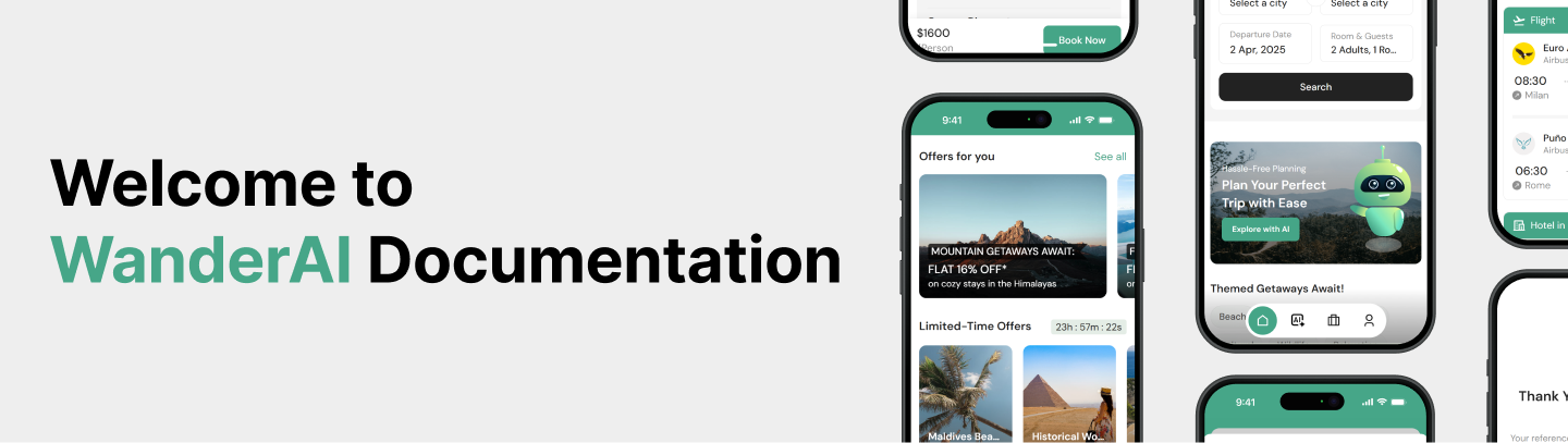
Welcome to the documentation for WanderAI – AI Travel PWA with React Next JS – a modern, fully responsive React Next.js PWA (Progressive Web App) template designed for travel booking.

This template is built using Next.js, SCSS, and React Bootstrap, ensuring high performance, SEO optimization, and ease of customization. With PWA support, users can install your app on their devices and enjoy an app-like experience with offline access, faster load times, and push notifications.

Key Features

  • Built with Next.js 14 & TypeScript – Supports Server-side Rendering (SSR) & Static Site Generation (SSG).
  • Progressive Web App (PWA) – Installable, offline support, and fast performance.
  • Fully Responsive – Works seamlessly across all devices.
  • SCSS Styling – Customizable with global variables and mixins.
  • Reusable Components – Modular and well-structured React components.
  • SEO Optimized – Pre-rendering for better search rankings.
  • Dark Mode Support
  • Fast & Lightweight – Optimized code for quick loading.

Progressive Web App (PWA) Benefits

  • Installable – Users can add the app to their home screen.
  • Offline Support – Works even when there's no internet connection.
  • Faster Load Times – Caching improves performance.
  • App-Like Experience – Full-screen mode and smooth navigation.

Live Demo & Support

Live Demo: https://wanderai.vercel.app/

Support: support@focalthemes.com

Installation Guide

System Requirements

Before installing, ensure you have the following:

Check your Node.js version by running:

node -v

Download & Extract the Template

  1. Purchase & Download the ZIP file from ThemeForest.
  2. Go to your ThemeForest Downloads section.
  3. Click Download and choose "All files & documentation".
  4. Extract the downloaded ZIP file to your desired location.

Your extracted folder should look like this:


 📂 wanderai/
    ├── 📂 documentation/
    ├── 📂 template-files/
    ├── README.md
    ├── license.txt
                                        

Install Dependencies

Navigate to the template-files folder and install dependencies:


cd template-files
npm install

or

yarn install
                                        

Run the Development Server


npm run dev

or

yarn dev
                                        

Build for Production


npm run build
                                        

Folder Structure Overview


📂 project-root/
├── 📂 public/               # Stores all images and videos
│
├── 📂 src/                  # Source code
│   ├── 📂 app/              # Next.js app pages
│   │   ├── _app.tsx         # calling service worker
│   │   ├── ClientLayout.tsx # Client side layout
│   │   ├── layout.tsx       # Global layout
│   │   ├── not-found.tsx    # Not Found page
│   │   ├── page.tsx         # Main entry page
│   │
│   ├── 📂 components/       # Reusable UI components
│   │
│   ├── 📂 data/             # Data files (static data)
│   │
│   ├── 📂 elements/         # UI elements (buttons, inputs, etc.)
│   │
│   ├── 📂 styles/           # Global and SCSS files
│   │   ├── _mixins.scss     # SCSS mixins
│   │   ├── _variables.scss  # SCSS variables
│   │   ├── global.scss      # Global styles
│
├── next.config.js           # Next.js configuration
├── package.json             # Package dependencies
├── tsconfig.json            # TypeScript configuration
├── README.md                # Documentation file                                                                                
                                        

Usage Instructions

How to change the colors.

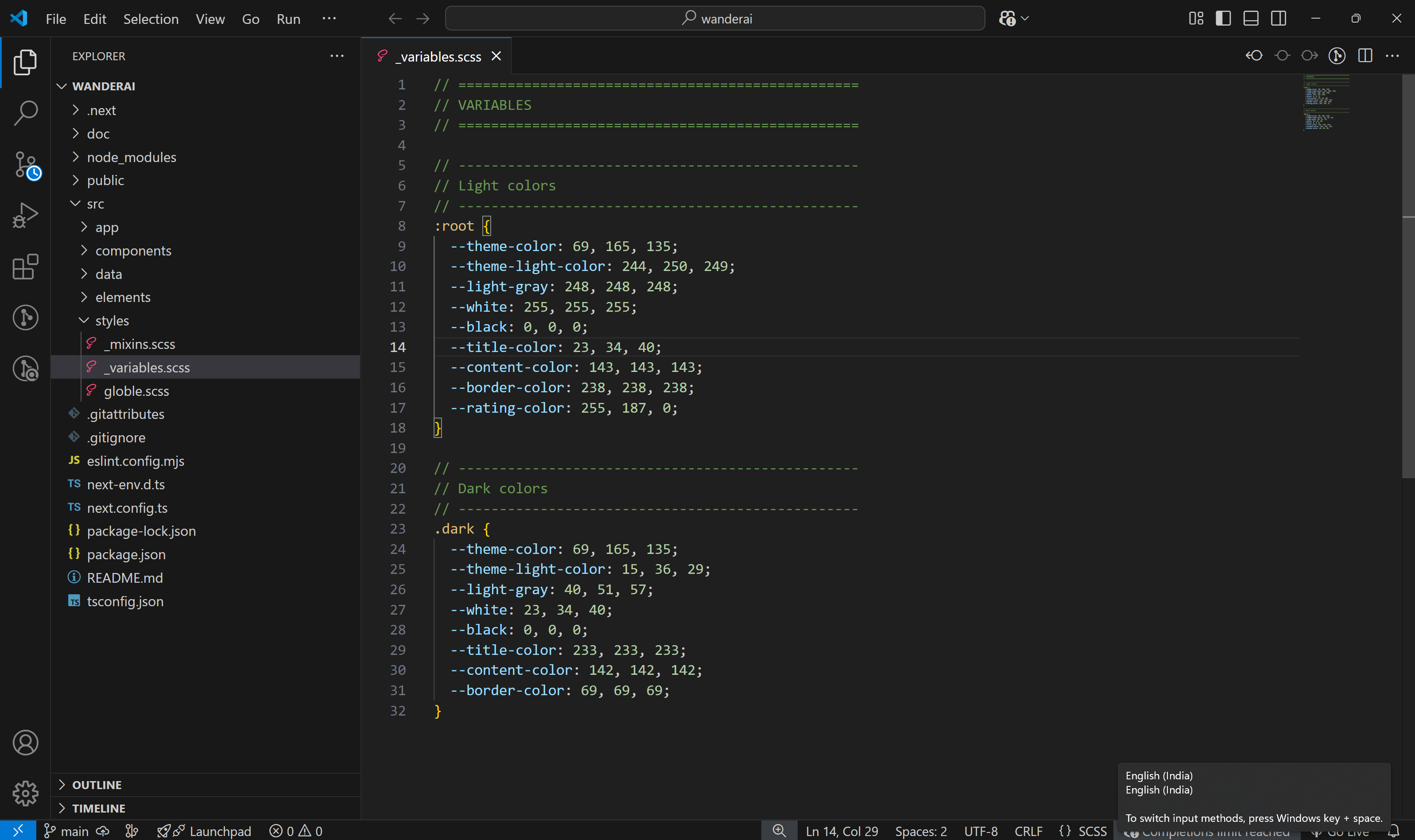
All colors in this template are defined using CSS variables inside the _variables.scss file. The colors are stored in RGB format so can easily adjust opacity using rgba().

To change the theme color, simply update the RGB values. For example, to set the theme color to blue, change:


--theme-color: 0, 122, 255;  /* New theme color */
                                                

The dark mode colors are defined under the .dark class:


.dark {
    --theme-color: 69, 165, 135;  /* Theme color remains same */
    --white: 23, 34, 40;          /* Adjusted for dark mode */
    --black: 0, 0, 0;
}
                                                

Since the colors are stored in RGB format, you must use rgba() to apply opacity.


color: rgba(var(--theme-color), 1); /* Full opacity */
color: rgba(var(--theme-color), 0.8); /* 80% opacity */
                                                

Add or Remove Pages

All the pages are located in the src/app/ directory. Each folder inside app/ represents a route (URL) in your project.

To Add a Page:
  1. Go to:
    src/app/
  2. Create a new folder with the page name:
    Example:
    testimonial
  3. Inside that folder, create a page.tsx file:
    
    // src/app/testimonial/page.tsx
    'use client'
    
    const Testimonial = () => {
        return (
            <h1>Testimonial Page</h1>
        )
    }
    
    export default Testimonial                                                    
                                                    
  4. Now visit:
    http://localhost:3000/testimonial
To Remove a Page:
  1. Go to
    src/app/
  2. Delete the folder for that page (e.g.,
    testimonial/
    )
  3. That route will no longer be available in the browser.

Add or Remove Components

All components are organized inside the src/components/ directory. Each component usually has its own folder with a .tsx file and a .scss file.

To Add a Component:
  1. Go to:
    src/components/
  2. Create a new folder with the page name:
    Example:
    Testimonial
  3. Inside it, create the component files:
    
    // src/components/Testimonial/Testimonial.tsx
    'use client'
    
    import './Testimonial.scss';
    
    export default function Testimonial() {
        return <div className="testimonial">Testimonial Section</div>;
    }
                                                        
    
    /* src/components/Testimonial/Testimonial.scss */
    .testimonial {
      padding: 2rem;
      background-color: rgba(var(--theme-color), 0.1);
    }
                                                        
  4. Import and use it in a page or another component:
    
    import Testimonial from '@/components/Testimonial/testimonial';
    
    <Testimonial />
                                                        
To Remove a Page:
  1. Locate the component folder inside
    src/components/
  2. Delete the folder(e.g.,
    Testimonial/
    )
  3. Remove any references/imports from pages or other components

Customization Guide

Changing Global Styles

Global styles help you maintain consistency across your entire project—like resetting default browser styles, defining typography, setting up layout rules, and importing fonts. All global styles are managed in one place to make them easy to customize.

How to Update Global Styles
  1. Open:
    src/styles/global.scss
  2. Edit or Add Rules:

    Here are a few examples of what you can customize:

    Body & Typography
    
    body {
        position: relative;
        background-color: rgba(var(--white), 1);
        font-weight: normal;
        -ms-overflow-style: none;
        scrollbar-width: none;
        margin: 0;
        padding: 0;
        color: rgba(var(--title-color), 1);
        font-size: responsive-value(16px, 14px);
    }
                                                        

    responsive-value()

    This template uses a responsive-value() SCSS function to create fluid, scalable styles like font sizes or spacing between 320px and 1920px viewport widths.

    Example: font-size: responsive-value(16px, 14px); sets font-size to 16px on large screens and 14px on small screens, scaling smoothly in between.

    Section space
    
    .section-t-space,
    section {
        padding-top: responsive-value(50px, 35px);
    }
    
    .section-b-space {
        padding-bottom: responsive-value(50px, 35px);
    }
    
    .section-title {
        color: rgba(var(--title-color), 1);
        font-weight: 600;
        margin-bottom: 18px;
        margin-top: -4px;
        font-size: responsive-value(22px, 19px);
    
        a {
        margin-left: auto;
        font-size: 18px;
        }
    }
                                                        
    Container Style
    
    .container {
        padding-left: 15px;
        padding-right: 15px;
        
        @media (min-width: 1400px) {
            max-width: 760px;
        }
        
        @media (min-width: 1200px) {
            max-width: 740px;
        }
        
        @media (min-width: 992px) {
            max-width: 720px;
        }
        
        @media (min-width: 768px) {
            max-width: 580px;
        }
    }
        
    .container-fluid {
        padding-left: 15px;
        padding-right: 15px;
    }
                                                        

Modifying Components

This template includes a set of reusable, customizable components to speed up development and maintain consistency. All components are located in the src/components/ folder, and each component has its own folder with a .tsx and .scss file for structure and styling. Below are examples of how to modify two commonly used components: AppButton and InputField.

AppButton Component

The AppButton is a reusable button component with support for icons, images, and multiple predefined styles.

Path:

src/components/AppButton/AppButton.tsx  
src/components/AppButton/AppButton.scss                                            
                                            
Style Variants (via className)
Class Name Description
btn-dark Dark background with light text
btn-theme Theme color background
btn-theme-light Light background with theme color
btn-outline-theme Transparent with theme-colored border
btn-outline-dark Transparent with dark border
btn-outline-light Transparent with light border
Usage Example

<AppButton
    text="Continue"
    className="w-100 btn-theme"
    icon={<RiArrowRightLine />}
    onClick={handleClick}
    iconPosition="right"
/>
                                            
InputField Component

The InputField component is a flexible, reusable form input element with support for multiple types including text, email, password, number, tel, select, textarea, date, and expiry (MM/YY format).

Supported Types
  • text, email, password, number, tel
  • select (with options)
  • textarea
  • date (with toggleable picker)
  • expiry (auto-formats to MM/YY)
Usage Example

<InputField
    id="email"
    type="email"
    label="Email Address"
    placeholder="Enter your email"
    value={formData.email}
    onChange={handleChange}
/>

<InputField
    id="country"
    type="select"
    label="Select Country"
    options={[
    { label: "India", value: "in" },
    { label: "USA", value: "us" },
    ]}
    value={selectedCountry}
    onChange={handleSelect}
/>
                                            

Note: The above are just examples. The template also includes other reusable components like ActionPanel, Sidebar, Cards, Wrapper, TitleBar, and more — all customizable and located in the components/Common/ folder.

Data Management & Mock Integration

This template is designed as a front-end-only solution and does not include live API integration by default. However, all dynamic data used in the template is organized in the src/data/ folder to simulate API-like structure.

You’ll find multiple .ts and .tsx files such as:
  • ActionPanelLinks.tsx – Navigation links used in the action panel
  • Blogs.ts – Blog listing data
  • Category.ts – Category options for filters or listings
  • FooterLinks.tsx – Footer navigation or informational links
  • Packages.ts – Travel packages
  • and others...

Files extension

Files with .tsx extension include icons or JSX elements, while .ts files include only JSON-like data.

Deployment Guide

This template is built with Next.js 14 and supports both Static Site Generation (SSG) and Server-Side Rendering (SSR). After customizing the template, you can deploy it on any modern platform like Vercel, Netlify, DigitalOcean, or your own hosting.

Build Commands

npm run build
                                            
To preview the production build locally:

npm run start
                                            

This is a frontend template. Ensure that you replace demo content and mock data with real content or API integration before going live.

FAQs & Troubleshooting

How to fix SCSS/CSS not loading?

  • Ensure SCSS files are properly imported in each component.
  • Restart your development server after modifying any global styles.
  • Check for typos in SCSS file paths or class names.

Facing npm install or dependency errors?

  • Delete node_modules and package-lock.json and reinstall:
    
    rm -rf node_modules package-lock.json
    npm install
                                                        
  • Make sure you're using a supported Node.js version
  • Use npm install --legacy-peer-deps if you encounter peer dependency issues.

Can’t see changes after editing components?

  • Ensure you have saved all changes and that your dev server is running.
  • Restart the development server:
    
    npm run dev
                                                        
  • Use npm install --legacy-peer-deps if you encounter peer dependency issues.

How to switch between light and dark mode?

  • This template supports dark mode using a .dark class on the html or body tag.
  • Simply add or remove the dark class to toggle the theme.
  • All color variables are defined using CSS variables in :root and .dark for easy theme switching.

Why are icons not displaying properly?

  • Ensure all required icon libraries (e.g., Remix Icon) are correctly installed.
  • Also check that the imported icon components are valid and supported.

Why aren’t images or videos loading?

  • Make sure your assets are placed inside the public folder.
  • When referencing assets, use the correct relative path (e.g., /images/filename.jpg).

Credits & Support

Credits

Support

If you face any issues with the template or need help with customization:

  • Email Support: support@focalthemes.com
  • Bug Reports: Include the error message, browser version, and steps to reproduce.
  • Documentation: Please refer to the full documentation for installation and usage instructions.

We aim to respond to all support queries within 12–24 hours on business days.